
TOOLS USED
- Concept Map and Task Flows: AXURE RP 9
- Sketches: Procreate
- Annotation: Adobe InDesign
- Wireframes and Prototype: Adobe XD
- Video: Adobe XD
TIMELINE
The timeline for the design was 8 weeks.
CHALLENGE
This project is focused on designing a Dashboard for an Incident Reporting portal for administrators and managers of a Nursing Home. This portal will allow the managerial staff to report incidents, injuries, illnesses, and near misses, and to be able to collect a repository of reports. The portal will also allow the staff to generate Worker’s Compensation Reports, as well as OSHA 300 and 301 Forms to then be able to submit those to the appropriate agency.
The portal also has a dashboard where the managers and administrators will be able to see, at first glance, their institution’s status as far as incidents and cases that have been reported. The dashboard will show some graphs that display this information clearly and efficiently.
Some features required for this portal are:
- Login/Logout
- Create/Edit Profile
- Create a New Report
- Access to different report types (injury/illness, property damage, near miss)
- Save in-progress report
- Edit in-progress report
- Attach Files to report: Images, Videos, Audio Notes
- Complete/Submit report
- Review Submitted report
- Add the review to report
- View case status
- Complete and submit a form with confirmation modal (showing case number)
- Email confirmation for report submission with a case number
- Print submitted form with a case number
- Show confirmation with report number for submitted forms; submitted by and date tracked by the system
- Repository of incomplete and submitted forms
- Dashboard analytics
PRODUCT DESCRIPTION
This dashboard has been designed specifically for a desktop computer and the design is to be responsive as well. The portal is intended to be used by nursing home personnel which includes managers and administrators with average computer skills. The dashboard is for users to be able to get an at-a-glance look at the institution’s incident reporting stages, reporting for worker’s compensation and determining if the incident is reportable to OSHA or not. The portal is meant to be easy to use and to understand. Minimal training should be required to be able to learn and use the product.
TARGET USERS
Nursing Homes are usually open 24 hours a day / 7 days a week. There are different departments in each nursing home which include: HR, housekeepers, maintenance staff, nursing department, administrators, managers, and dining service staff.
Nursing department employees include:
- Certified Nurse Aides (CNA)
- Certified Medical Aides (CMA)
- Licensed Vocational Nurses (LVN)
- Assistant Director of Nursing (ADON)
- Director of Nursing (DON)
- Administrators
- Managers
SECONDARY RESEARCH
In the secondary research I found that many of the incident reporting systems are not as accessible to the general public since there is confidential and private information being shared. Some of the questions to be addressed by this portal include:
- How do you create an incident report?
- Who is allowed to create the report?
- What is considered an incident?
- Which reports become cases?
- What are types injuries are reportable?
- How do you create a Worker’s Compensation report?
- What happens after you submit a report?
- What analytics should be the most important?
- How do you submit reports to OSHA?
PROCESS
I began the process by doing secondary research on various dashboard designs as well as incident reporting systems so I could get familiarized with the product, the features required, and to determine the best way to create the best interface for it.
The goal for this interface is to be an intuitive, simple design, that is easy for the user to navigate.
After the secondary research, the following exercises were done to continue the process:
- Concept Map
- Task Flows
- User Flows
- Site Map
- Sketches
- Wireframes with annotations
- Prototype
CONCEPT MAP
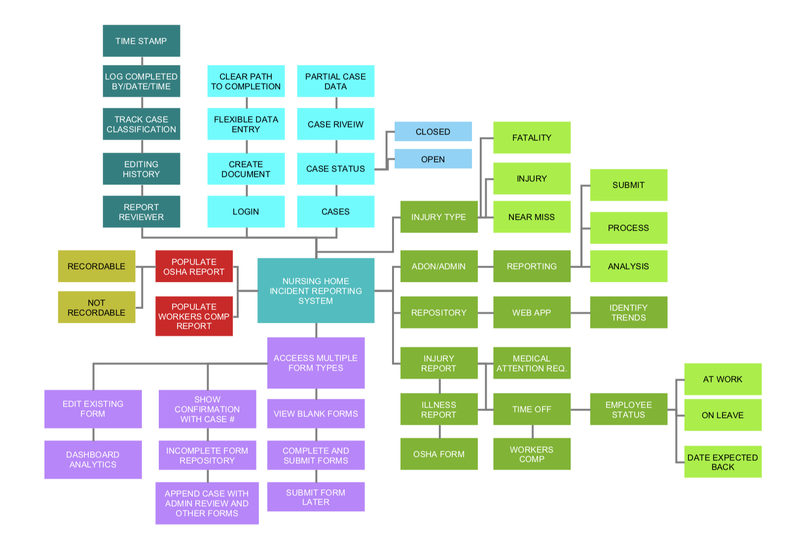
A concept map is a visual organization and representation of knowledge. It shows concepts and ideas and the relationships among them.
The concept map was created to give me an idea of what kinds of things can be done with a nursing home incident reporting portal, what functions are related, what needs to be included, what is essential and what has to be considered when approaching the user interface design.
TASK FLOWS
A task flow diagram shows how users travel through the system while performing a specific task. Task flows tend to be linear, showing the high-level steps that a person would take to get to a specific goal or endpoint.
Following the Concept Map, I created some task flows for the various tasks that were necessary for the dashboard. Below are some examples of the tasks to be completed:
- Edit in-progress report
- Attach Files to report: Images, Videos, Audio Notes
- Complete/Submit report
- Review Submitted report
- Add the review to report
- View case status
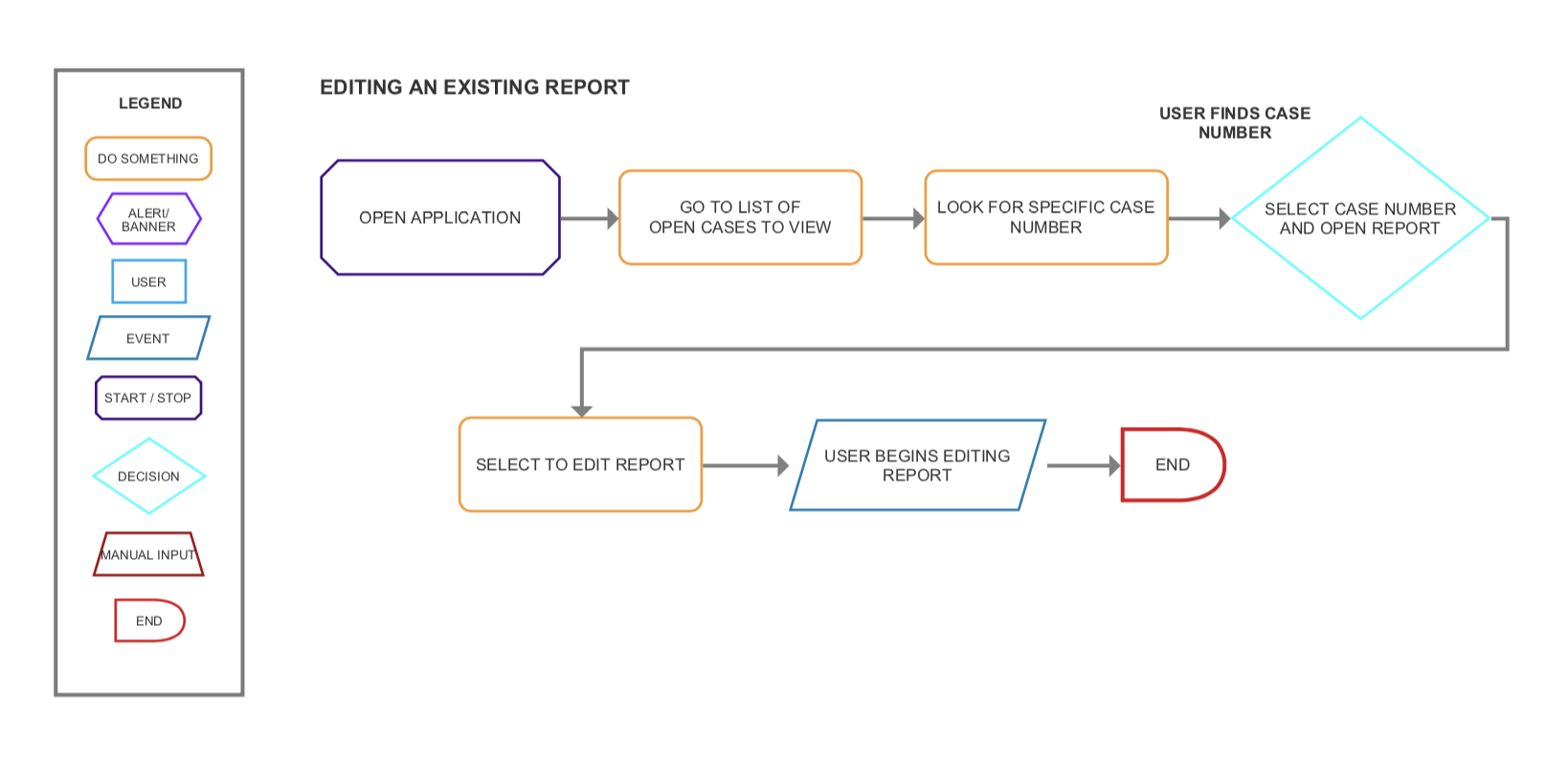
View all Task Flows here.
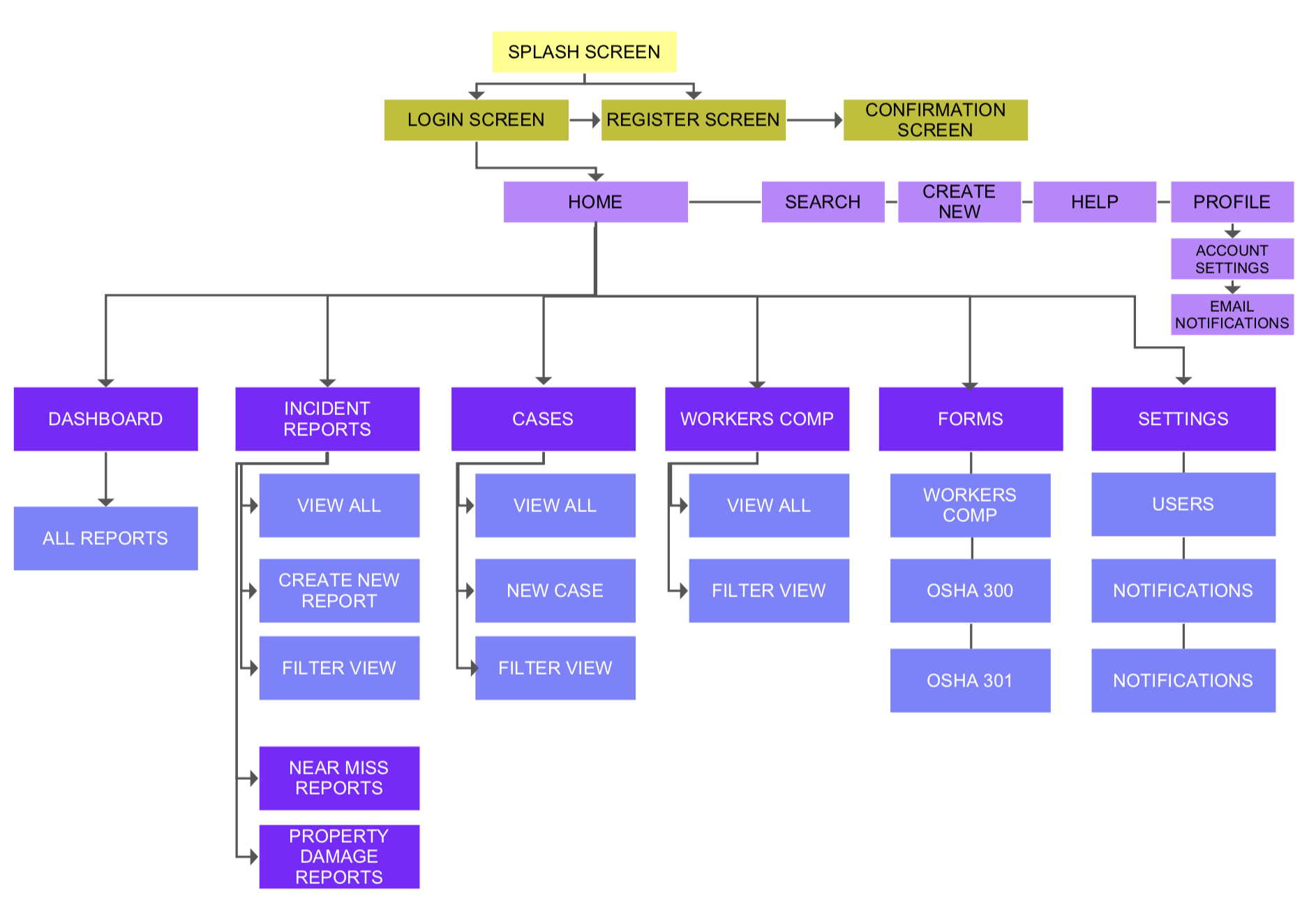
SITE MAP
A site map is a list of pages of an interactive application.
After creating and going over the requirements and refining the User Flows, I designed the site map that shows the screens that will appear on the portal.
SKETCHES
Inspired by the final site map, I started designing rough sketches of the various pages the portal will have. These sketches were discussed with the client and after learning about the main uses for this, the process brought on many changes to the initial design.
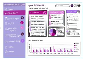

View all sketches here.
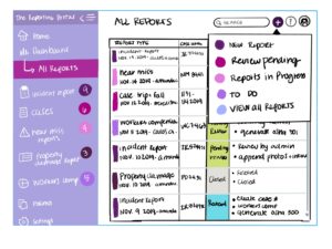
ANNOTATED WIREFRAMES
The following pages are the annotated wireframes for the dashboard design. These wireframes convey the structure of each screen, the content and the actions and behaviors the user might expect from each button. The labels on each screen correspond to the final site map. This exercise is great for myself to be able to discern how many screens will be needed for each section and to determine which ones will expand longer than the screen size with a scroll element, which I later removed from the final design.
Full documentation to Annotated Wireframes.
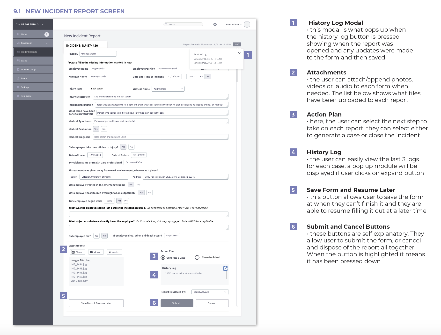
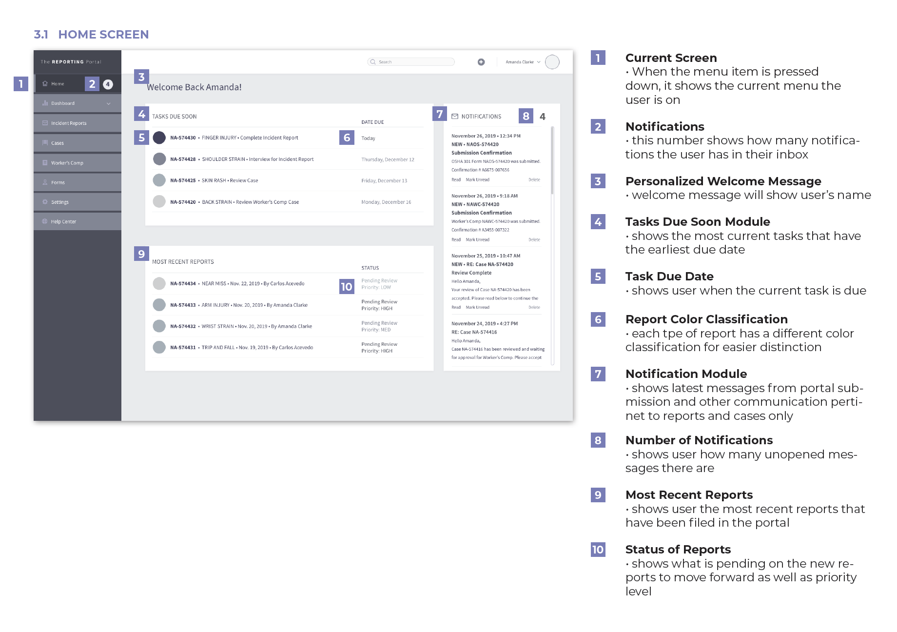
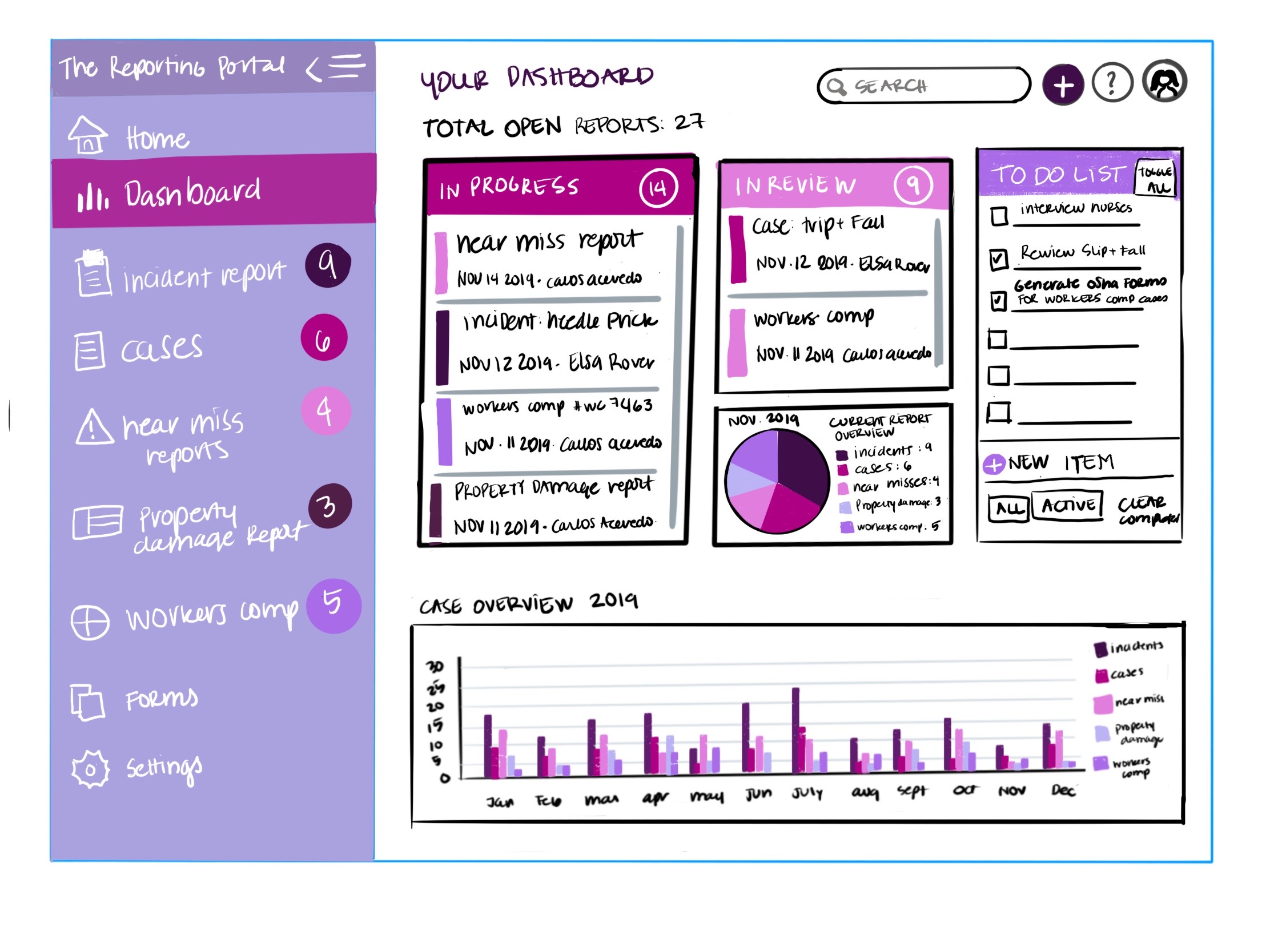
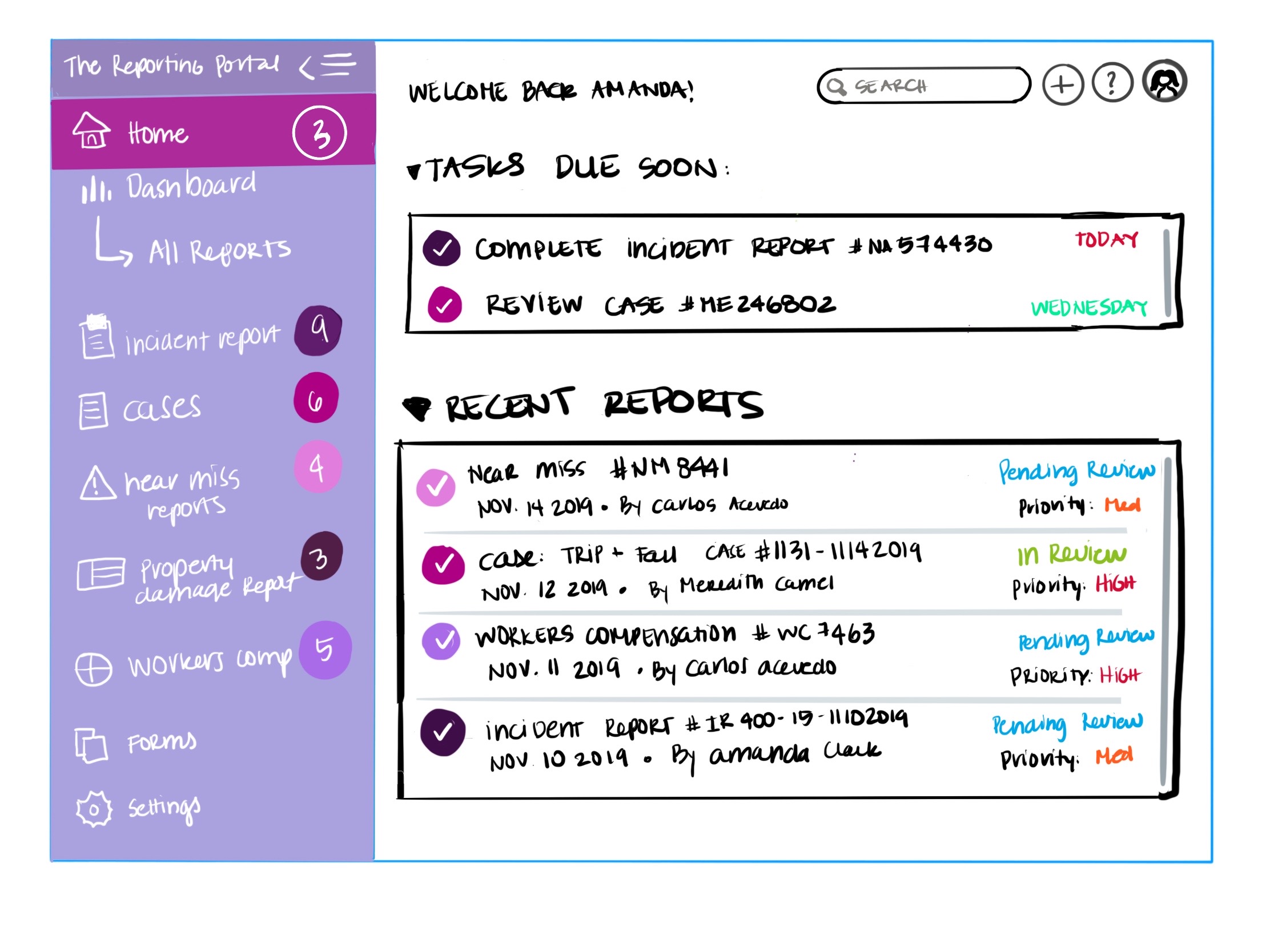
FINAL DESIGN
The following pages are the screenshots of my final design. The final screens follow the wireframes very closely. It was a great exercise to do the wireframes and see them transform with images and colors and see how the transitions from each screen work in the interface.
The dashboard allows the user to view all cases, filter through cases by incident type, filter by form type, the user can print the case file, they can review and also generate the appropriate reports and are able to follow up, and submit the forms and receive submission confirmations with a confirmation number individual to each case.
I believe the design is pretty self-explanatory and easy to use. I also included a Help Center tab for users to be able to learn how to use the portal.
PROTOTYPE


