This project is focused on designing an Android operating system user interface for a Body-Worn Camera.
A body-worn camera is a wearable audio, video, or photographic recording system used to record events in which police officers or other law enforcers are involved. They are typically worn on the torso of the body on the officer’s uniform camera is used by law enforcement’s first responders, such as police officers and highway patrol and corrections officers, to document incidents as they are happening.
The body-worn camera also helps build a relationship with the community by providing a higher level of trust in law enforcement that everything that transpires is recorded, discourages escalation during an incident and can be used as evidence.
The features required for this project are:
• Video Capture
• Pre-buffering Event Capture
• Photo Capture
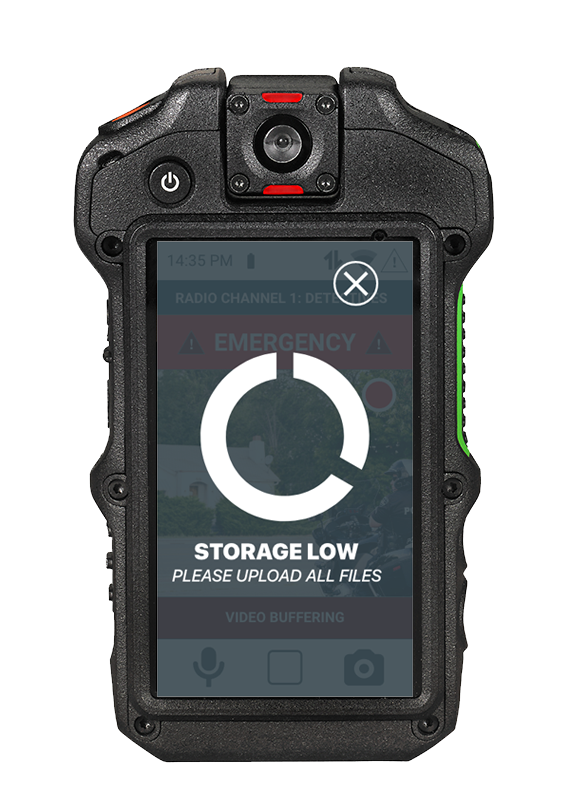
• System Notifications
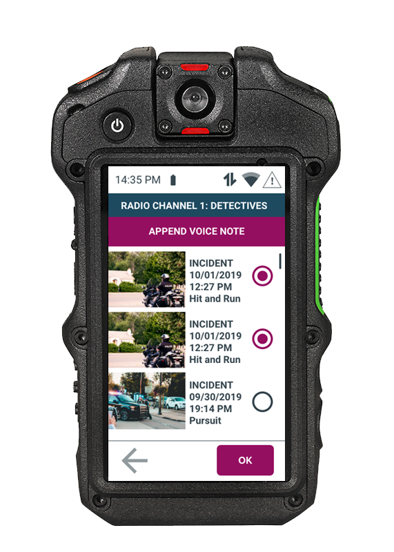
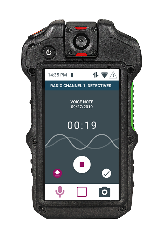
• Voice Note Capture
• Media Tagging and Integrated Metadata
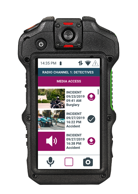
• Media Access & Management
•
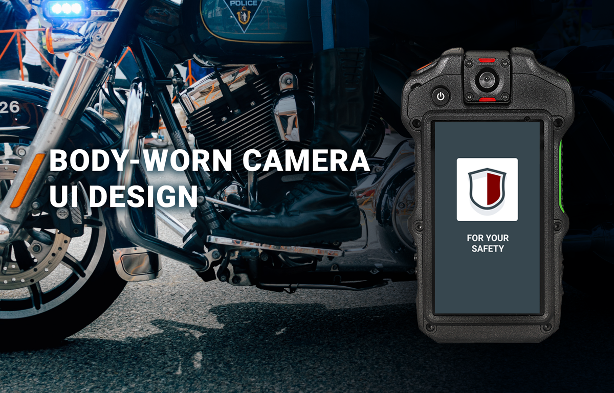
PRODUCT DESCRIPTION
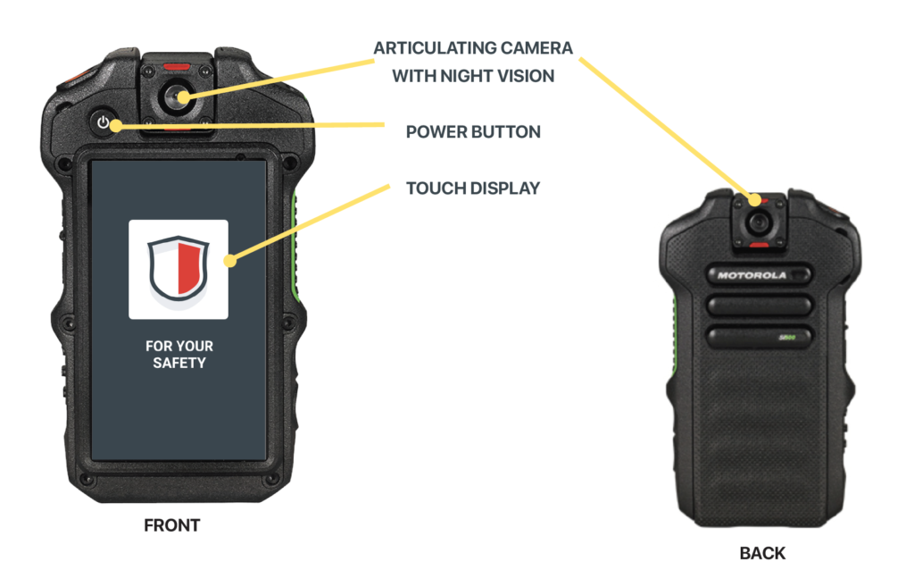
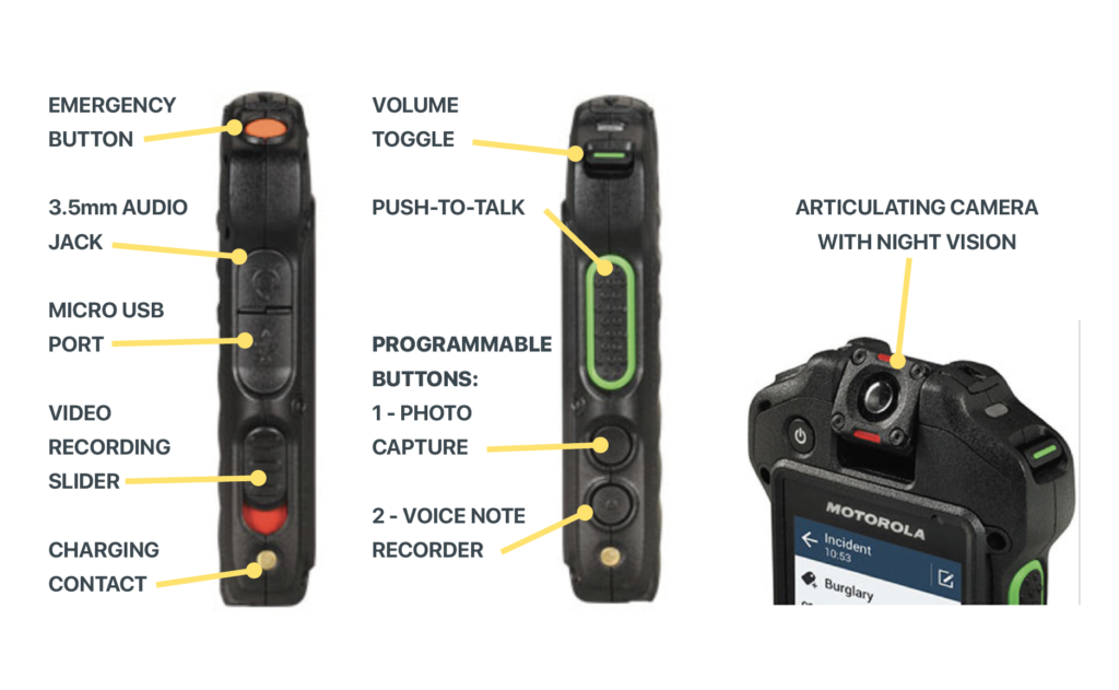
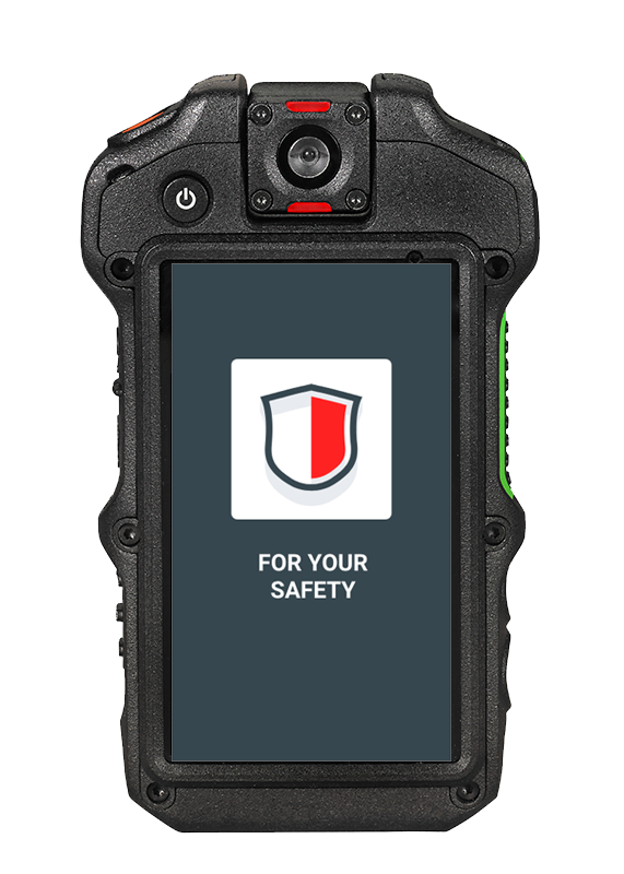
The product I designed this interface app for is the Motorola Si500 Body-Worn Camera.
The product requirements are:
• Android OS
• Device with a 3.2” (360×640 px) touch screen display
• Physical Controls:
– Push to Talk button
– Power Button
– Volume Toggle
– 2 Programmable Buttons
– Emergency Button
– Video Record Slider
The 2 programmable buttons as the photo capture and voice note capture.
https://www.motorolasolutions.com/en_us/products/police-cameras/si500.html#tabproductinfo
PROCESS
I began the process by doing secondary research on the body-worn cameras so I could get familiarized with the product,
The goal for this interface is to be an intuitive, simple design, that is easy for the user to navigate.
After the secondary research, the following exercises were done to continue the process:
– Concept Map
– Task Flows
– User Flows
– Site Map
– Sketches
– Wireframes with annotations
– Prototype
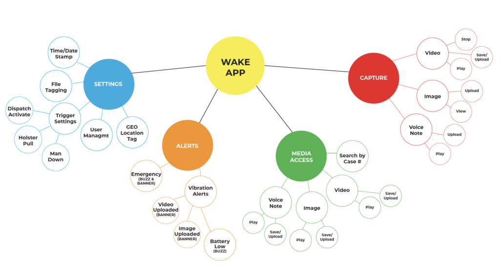
CONCEPT MAP
A concept map is a visual organization and representation of knowledge. It shows concepts and ideas and the relationships among them.
The c
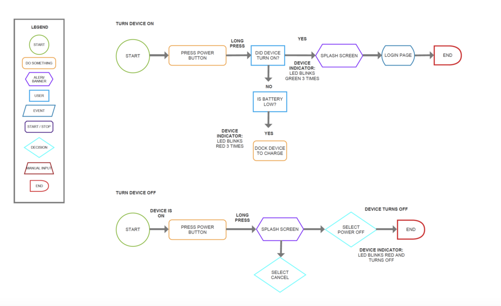
TASK FLOWS
A task flow diagram shows how users travel through the system while performing a specific task. Task flows tend to be linear, showing the high-level steps that a person would take to get to a specific goal or endpoint.
Following the Concept Map, I created some task flows which then were worked on to become User flows. Below are some examples of the tasks to be completed:
• Turn
• Change volume up/down
• Send/Cancel Emergency Signal
• Receive emergency alert/view who is sending the alert
• Start/Stop/Review and Upload video and audio recording
• Take/View and Upload pictures
• Search for an event capture
• Append captures
• View/Dismiss System Notifications
• View devi
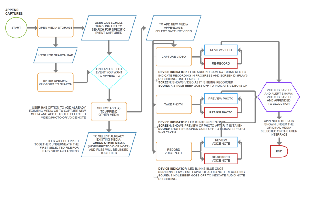
USER FLOWS
User flow is the path taken by a prototypical user on a website or app to complete a task. The user flow takes them from their entry point through a set of steps towards a successful outcome and final action, such as purchasing a product.
After the Task Flows, I produced user flows that guide the process of the user actually using the device and getting specific tasks completed including the user’s behavior, decision points, how the device indicators show, and optional routes to achieving the task.
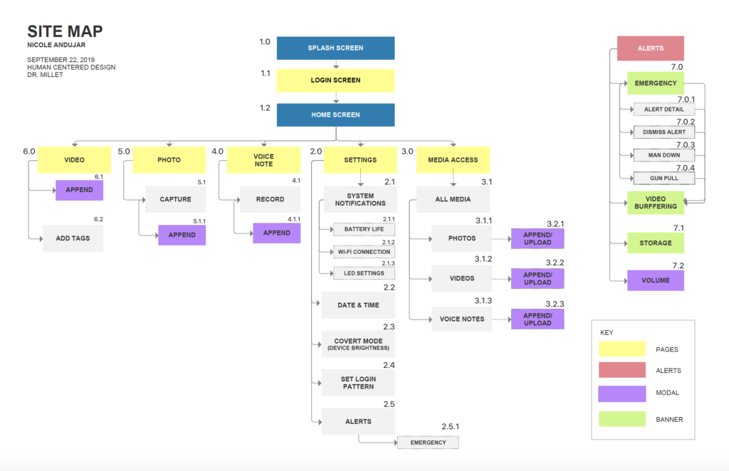
SITE MAP
A site map is a list of pages of
After creating and going over the requirements and refining the User Flows, I designed the site map that shows the screens that will appear on the device. As my design evolved, there were various iterations of the site map.
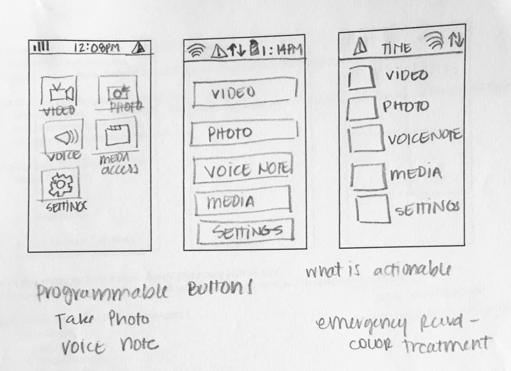
1ST ITERATION
– The screens were laid out as a website hierarchy with a video, photo and voice note appeared as the main buttons on the UI
– During class discussion and a Site Map exercise, this changed dramatically
2ND ITERATION
– The screens were now better organized, now showing a different hierarchy and a bit more simplified.
– Modals are now more visible
FINAL ITERATION (below)
Screens are more detailed and the Annotation reference numbers were added.
SKETCHES
Inspired by the final iteration of the site map, I started designing rough sketches of the home page. These sketches were discussed with the client and after learning about the main uses for this, the process brought on many changes to the initial design.
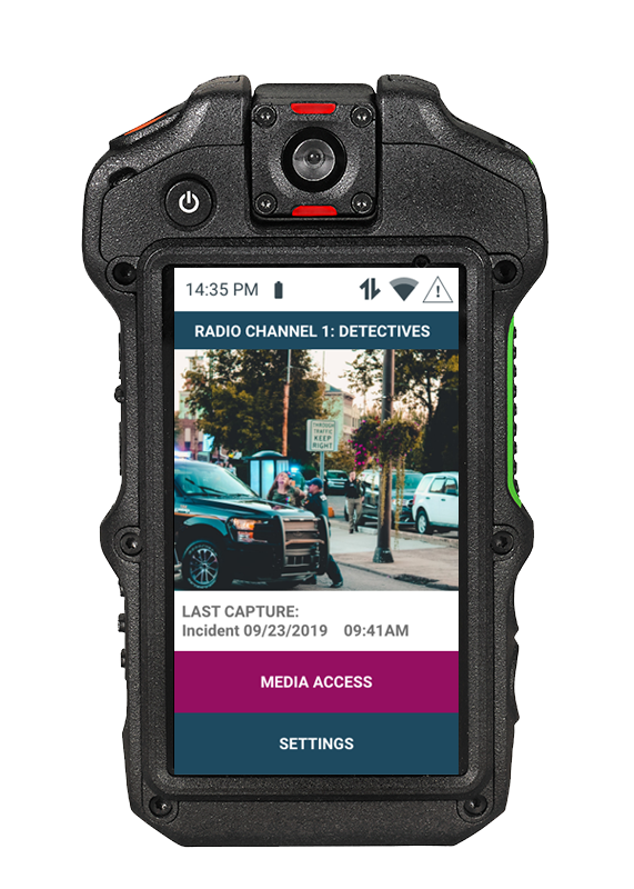
I decided to rethink the screens after this previous client meeting and developed a more simplified UI. The main screen would function as a way to access the media and the system settings as well as have a preview of the last captured video or photo.
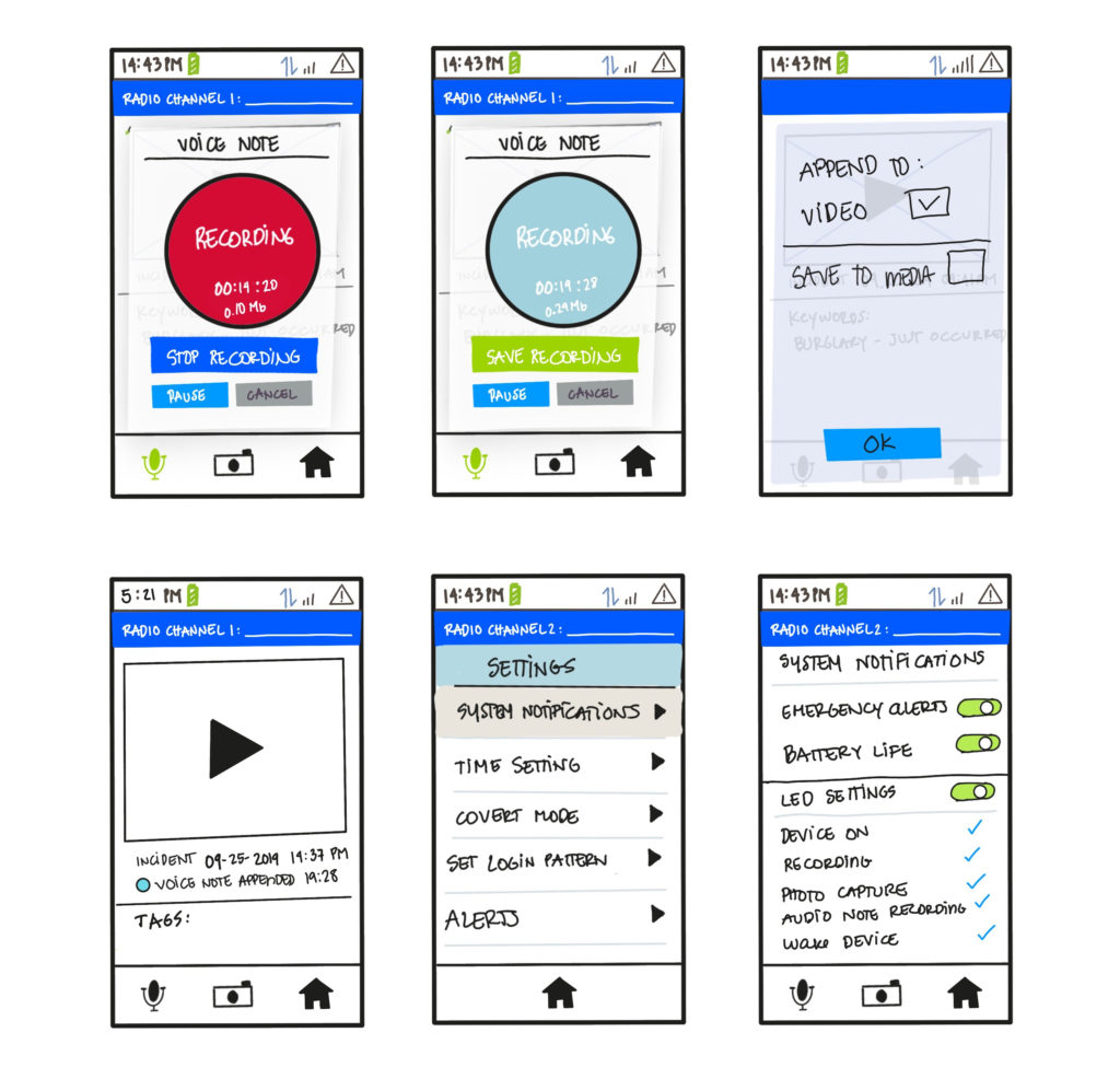
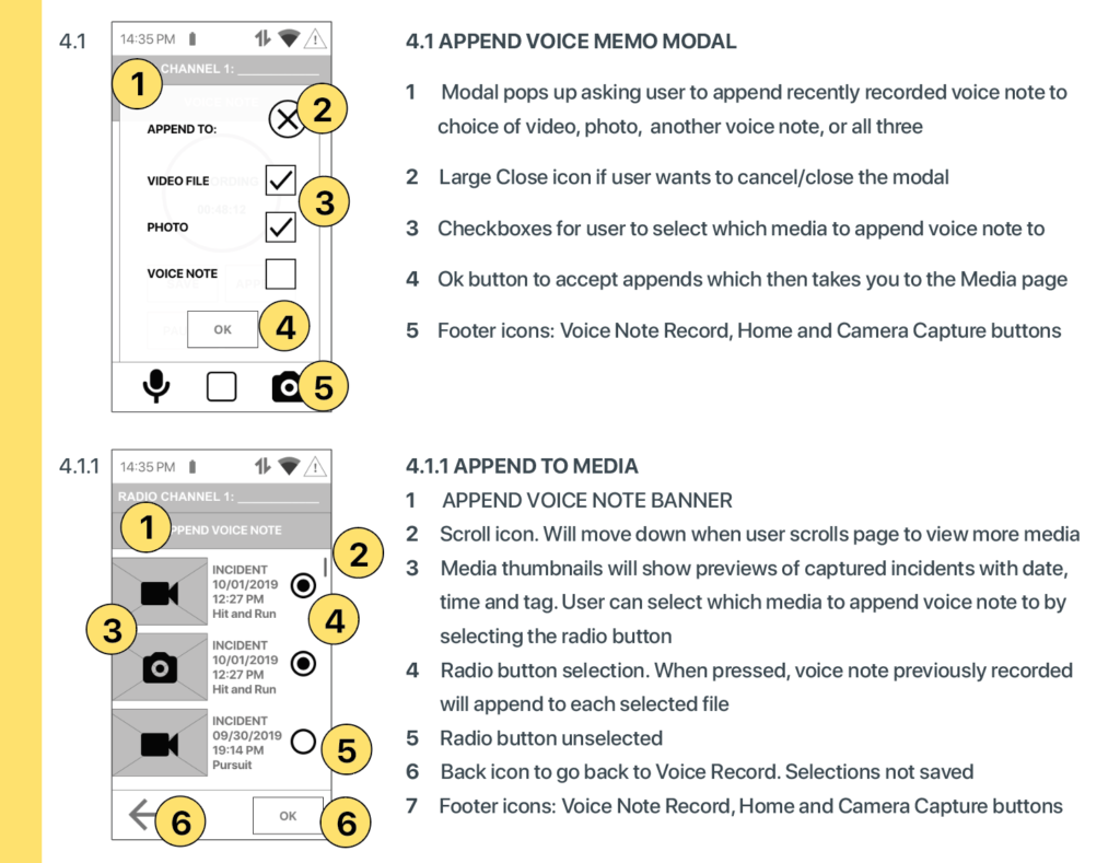
ANNOTATED WIREFRAMES
The following pages are the annotated wireframes for my design. These wireframes convey the structure of each screen, the content and the actions and behaviors the user might expect from each button. The labels on each screen corresponds to the final site map.
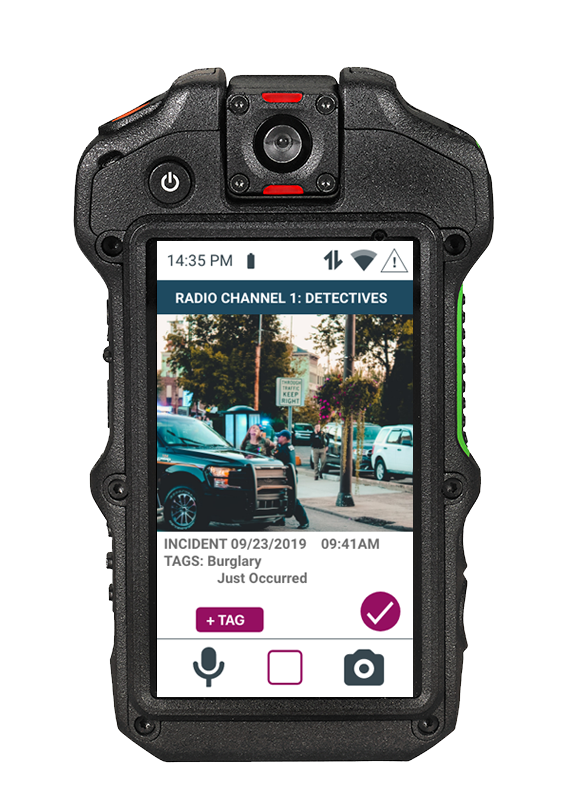
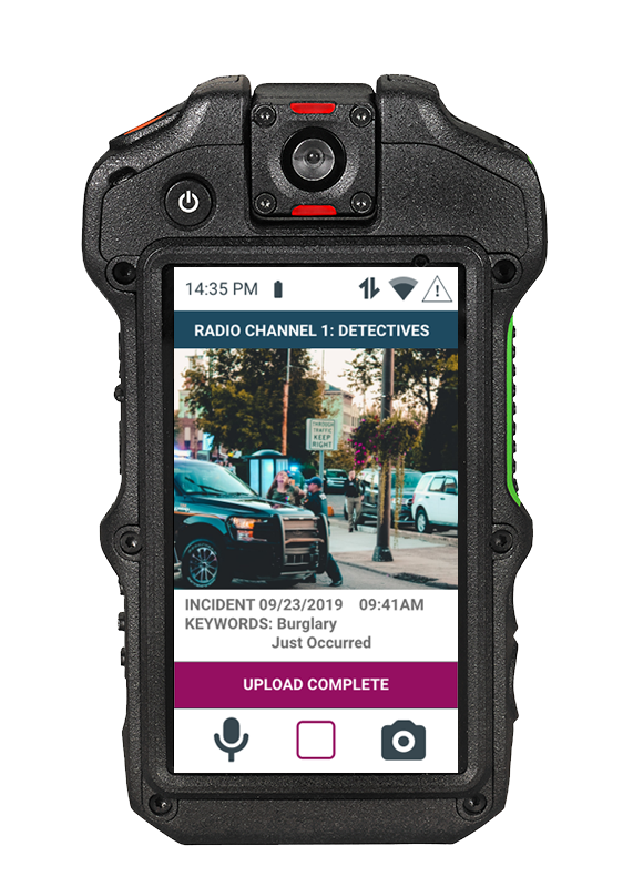
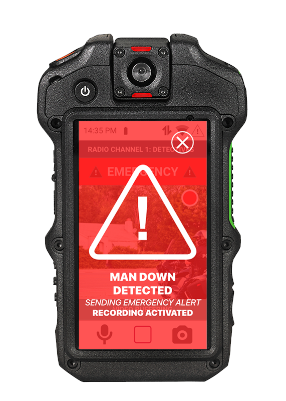
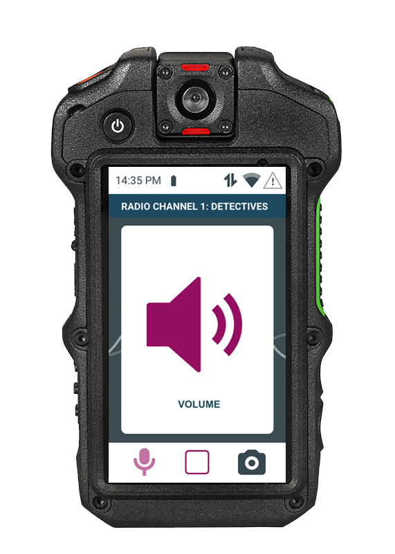
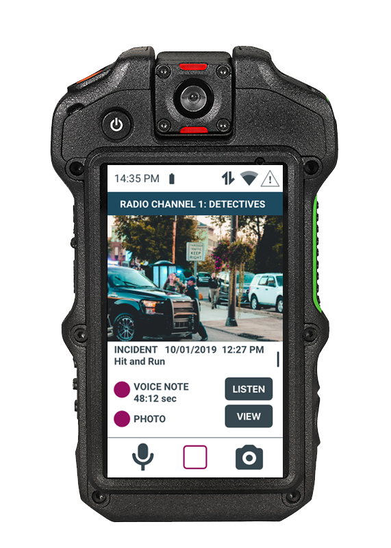
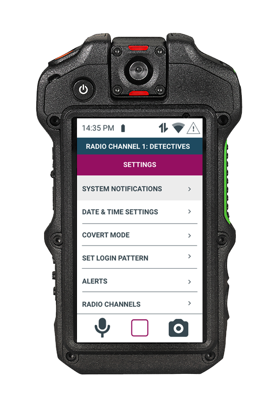
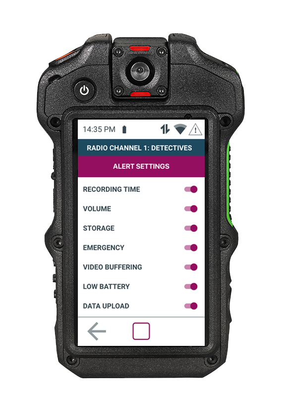
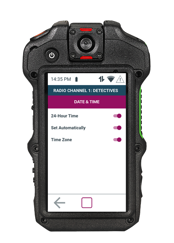
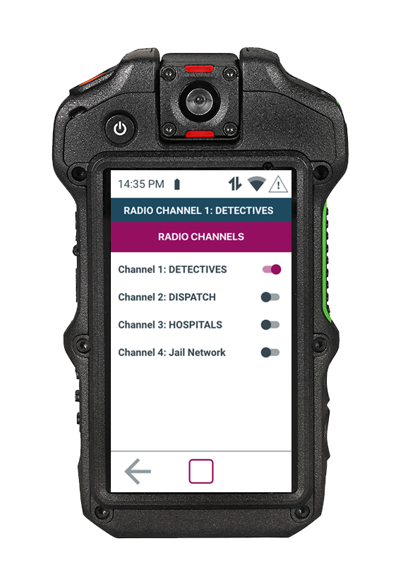
FINAL DESIGN
The following pages are the screenshots of my final design. The final screens follow the wireframes very closely. It was a great exercise to do the wireframes and see them transform with images and colors and see how the transitions from each screen works in the interface. I used an Android UI kit to make the design follow the look and feel for that operating system.
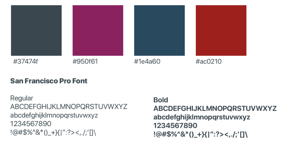
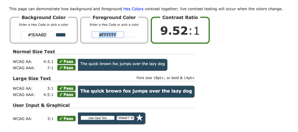
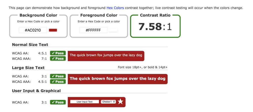
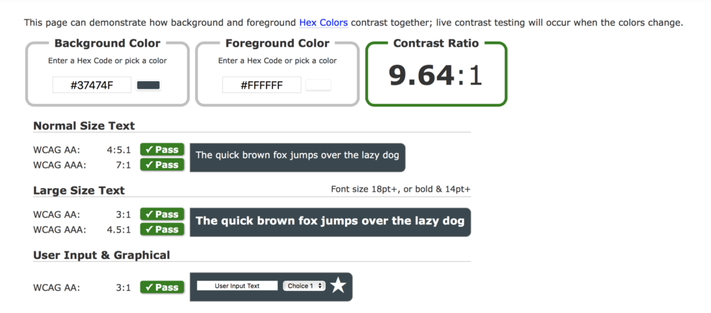
COLOR SCHEME AND STYLE GUIDE
The following is the color scheme of the design along with the style guide.
The font used is San Francisco Pro Font which is a very minimal, clean font, that is easy to read.
PROTOTYPE